Color Contrast
Color contrast most commonly refers to text color in relation to the background color.
If you want to use color to format your text, you should ensure adequate color contrast (at least a 4.5:1 contrast ratio between the text and background). It is also the case that some people will experience colors differently or as shades of grey. for this reason, it is best to avoid using these colors to communicate meaning to the reader. For example, using red text to provide an incorrect usage and green text to show correct usage. Color on text should never be the only design element used to emphasize or create structure in your document.
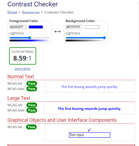
You can use the WebAIM contrast checker to check contrast ratio between text and background. Black text with white background is always a safe choice.

 How to Check Color Contrast In Word
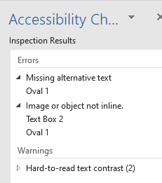
- The “Check Accessibility” feature embedded in Microsoft Office select the “Review” tab on the ribbon, then click “Check Accessibility”.
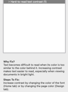
On the right hand side the “Inspection Results” will highlight “Hard-to-read text contrast” if the text-to-background ratio falls below a specific threshold.

- Simply follow the “Warnings” within the Inspection Results to increase the contrast.

 Takeaways
- It is important to remember to refrain from relying on only a change in color to signify meaning.
![]() Tips
Tips
- Checking Color contrast is easy.
- With free contrast checkers available online. For instance; WebAIM contrast checker.
- Student who are colorblind may have difficulty recognizing color differences.
- Avoid problematic color combinations, such as:
- Green & Red (the biggest one to avoid)
- Green & Brown
- Green & Blue
- Green & Gray
- Green & Black
- Blue & Gray
- Blue & Purple
- Use strong contrast between background color and text font color.
- Avoid adding text to complicated backgrounds.

