Template Selection and Styles
Accessible PowerPoint creation starts with selecting an accessible template. Verify that the template features legible fonts and sufficient color contrast between the text and the slide background.
You can enhance the accessibility of existing PowerPoint files content by applying built-in styles and templates that feature legible fonts and high-contrast colors. These templates leverage accessibility features provided by Windows and Office, including improved color contrast, larger font sizes, logically structured headings, and more.
In the case of accessible PowerPoint templates, Microsoft has enhanced the reading order of slide content and allocated a unique title space on each slide, allowing users to input their own titles. For instance, instead of every slide displaying ‘Click to add title,’ the accessible templates provide prompts like ‘Add a slide title 1,’ ‘Add a slide title 2,’ and etc.
Note: Accessible PowerPoint Templates include specific features such as reading order, appropriate font style and size, and color contrast, etc. to enhance the accessibility of the presentation.
Note: To ensure the presentation is legible and comprehensible, content creators must prioritize readability. Therefore, it’s imperative to ensure that text is easily readable.
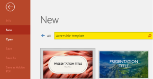
 How to Select Accessible Templates In PowerPoint?
- You can get the accessible template within Office Application.
- Type “Accessible Template” search for online templates and themes search.
- Select the template from the results based on your topic.

 Takeaways
- Using templates will help build accessible presentations.
- Use a large font size, preferably 18 pts. or larger.
- Avoid excessive use of all capital letters, italics, or underlining.
- Set heading font sizes to be at least 28 points.
- Use commonly recognized sans-serif fonts like Arial, Calibri, and similar choices.
![]() Tips
Tips
- Starting with an accessible template.
- Avoid using the ‘Blank Slide‘ layout for new slides. Beginning with a blank slide and adding elements can result in a disorganized structure where only certain content is accessible to a screen reader.
- PowerPoint has built-in, predesigned slide designs that contain placeholders for text, videos, pictures, and more. They also contain all the formatting, such as theme colors, fonts, and effects.

